
The hero is the first screen, and it has about three seconds to answer one question: am I in the right place. Everything else on your website is downstream of that answer.
Most businesses choose a hero by looking at what they find pretty. A better method is to choose by what you are actually selling, because the shape of the offer decides the shape of the screen.
Start with the shape of what you sell
One flagship product wants the whole stage to itself. A tight range of three wants to be compared side by side. A craft or a place that only makes sense across several photographs wants a sequence. A business with a mixed offer wants a layout that can hold different kinds of content at once without looking like a jumble.
Those four situations map cleanly onto four hero patterns, and once you know which situation you are in, the choice more or less makes itself.
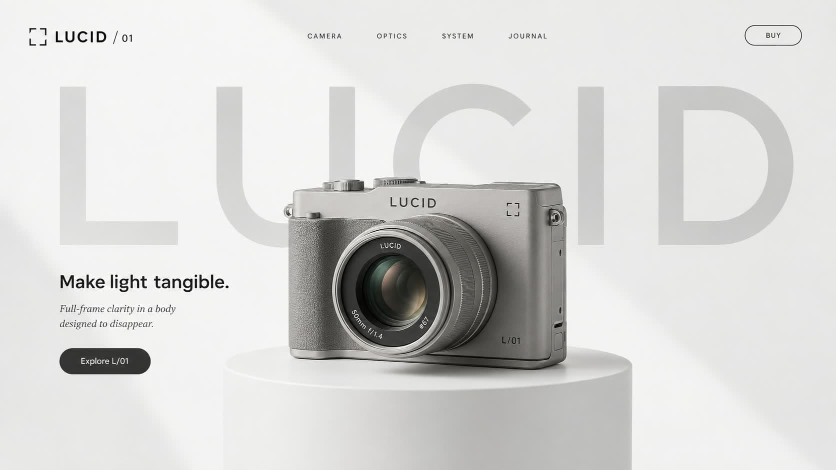
One product: the centred showcase
The item sits on a plinth in the middle of the screen, the brand name runs oversized behind it, and one short claim with one button does the rest. Removing choice focuses attention, and the visitor studies the product the way they would in a showroom.
It suits launches especially well because the page feels like a reveal. It is the wrong pick for wide catalogues, since it deliberately shows one thing.
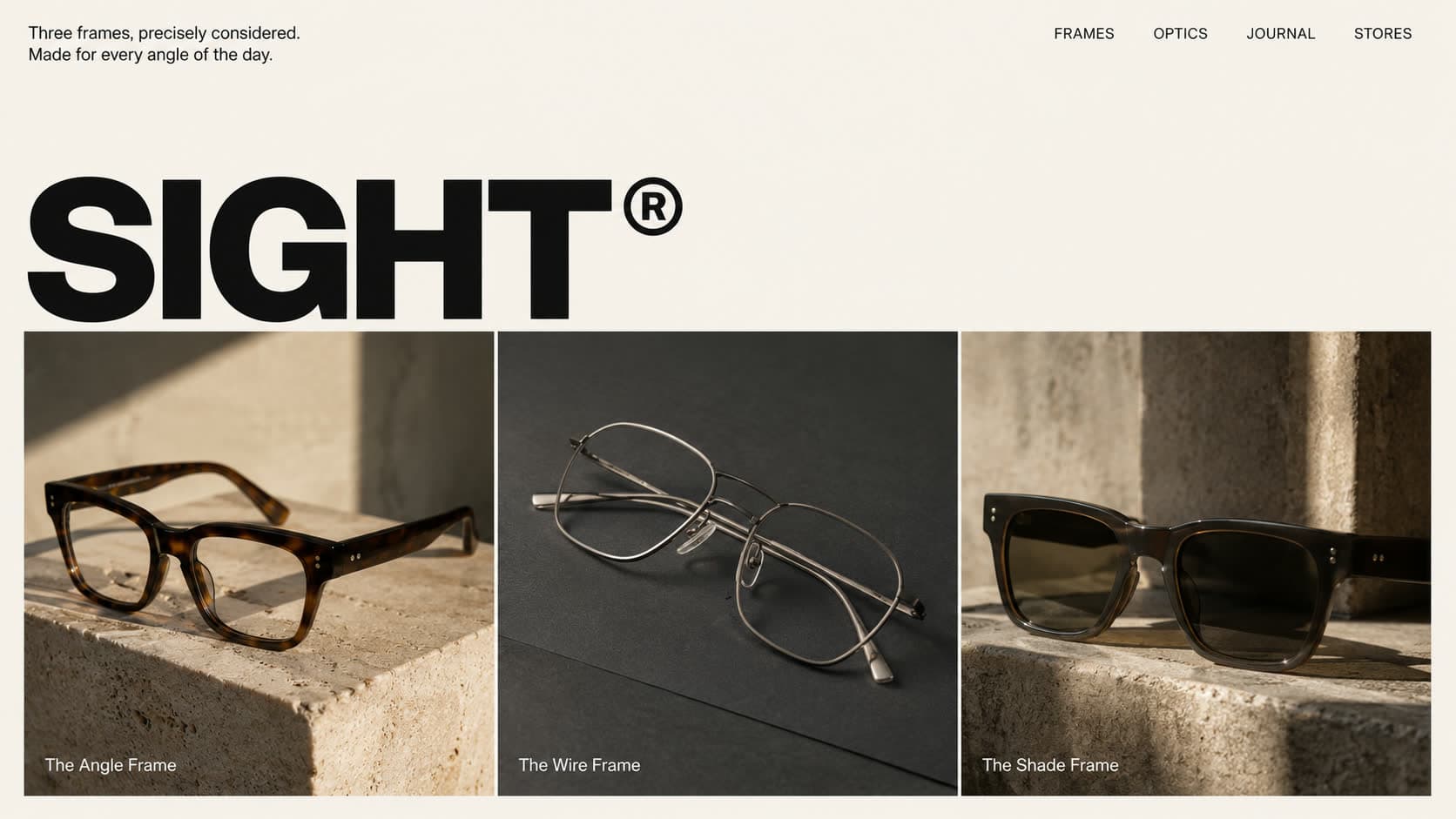
A range of three: the triptych
One enormous wordmark across the top, then exactly three products standing in their own panels beneath it. Three is the number people compare comfortably. Two feels like a coin toss and five becomes a catalogue.
Eyewear labels, leather workshops and bakeries proud of this morning's three bakes all land here naturally. It states the brand first and proves it immediately below.
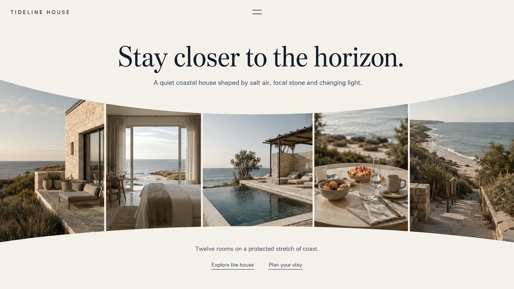
A story in photographs: the curved filmstrip
A quiet serif headline over a row of photographs that bends gently across the page. Five images fan out below the words, each a different angle on the same place or craft.
The curve is doing real work. A straight row of five photos reads as a catalogue, but an arc reads as a gesture, and the eye travels along it naturally so every image gets seen. Hospitality and craft brands feel instantly at home in it.
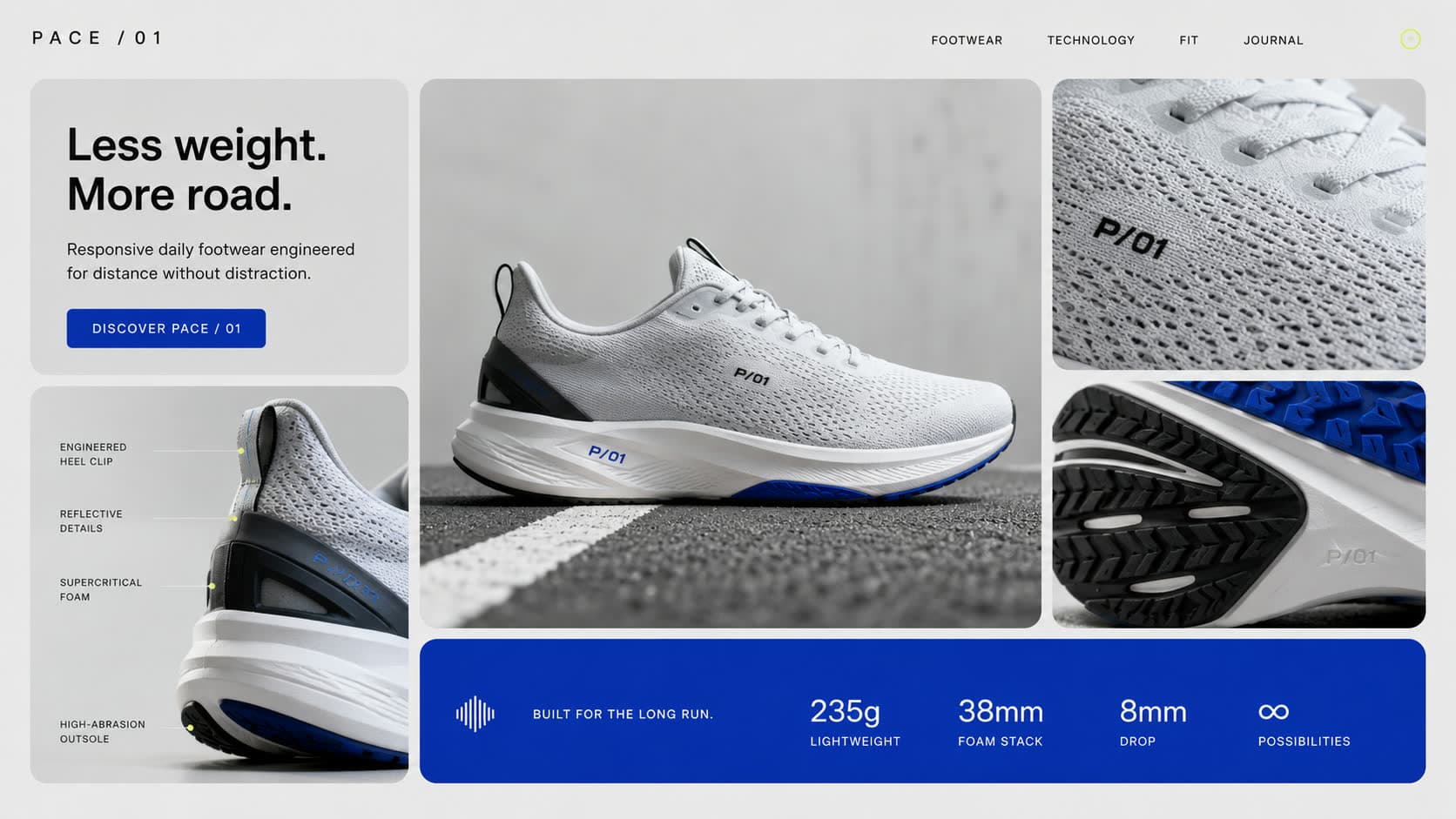
A mixed offer: the editorial bento
A magazine spread built from tiles, where the headline occupies one cell and photography, product shots and details fill the rest. It holds several kinds of content at once without any of them fighting.
This is the most flexible hero we build, which makes it the safe answer when a business does more than one thing and refuses to pick a favourite.
What every good hero needs anyway
Whichever layout you choose, the fundamentals do not change. One sentence that says what you do in plain language, one obvious next step, and photography good enough to carry the screen. A beautiful layout wrapped around a vague sentence still fails the three second test.
And keep one call to action, not three. Every extra button dilutes the first one.