
Hero pattern
Triptych Collection Hero
A massive wordmark over three products standing side by side.
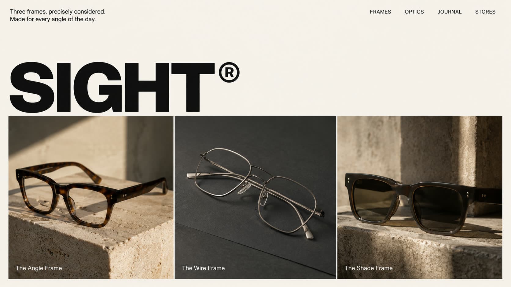
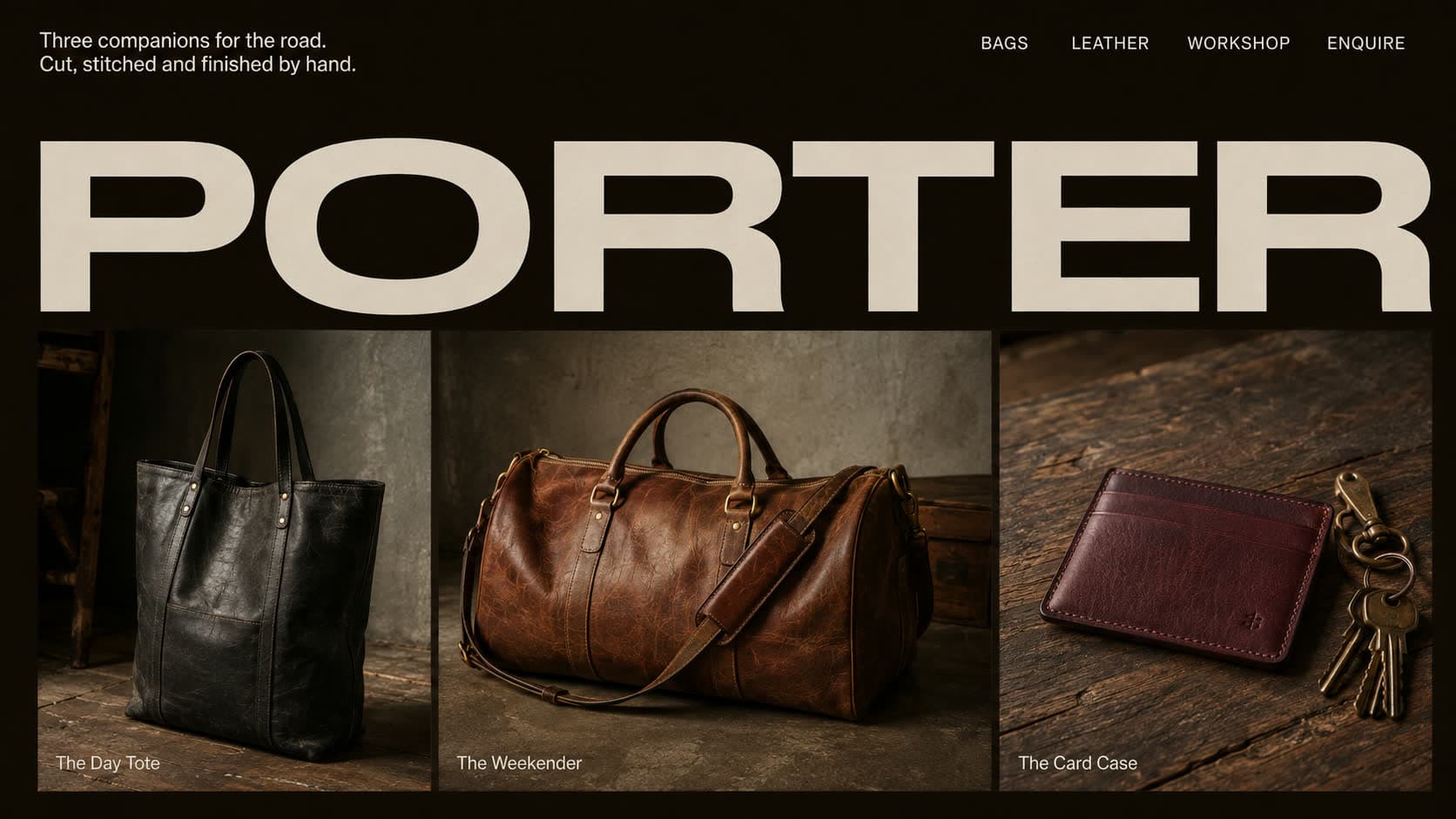
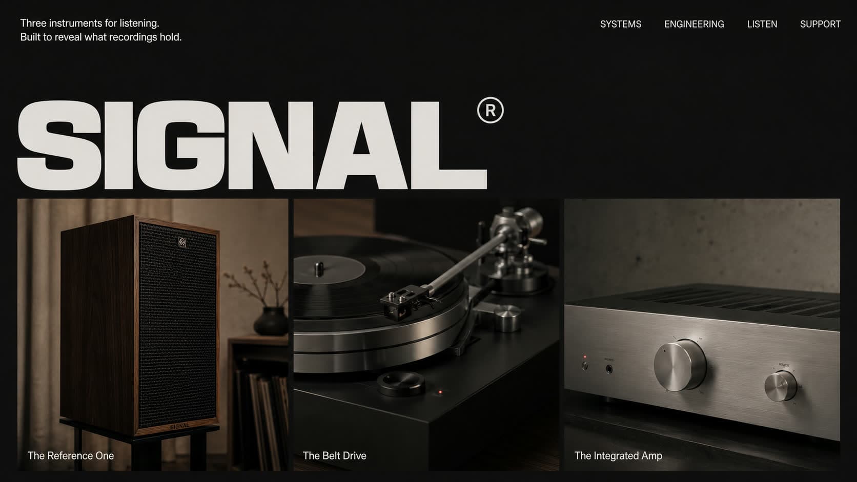
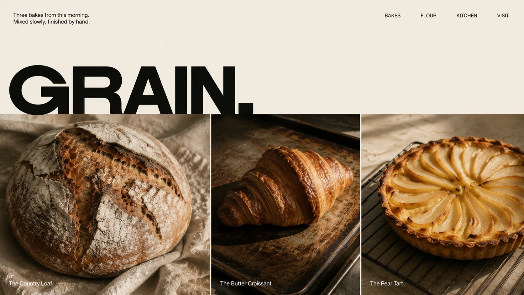
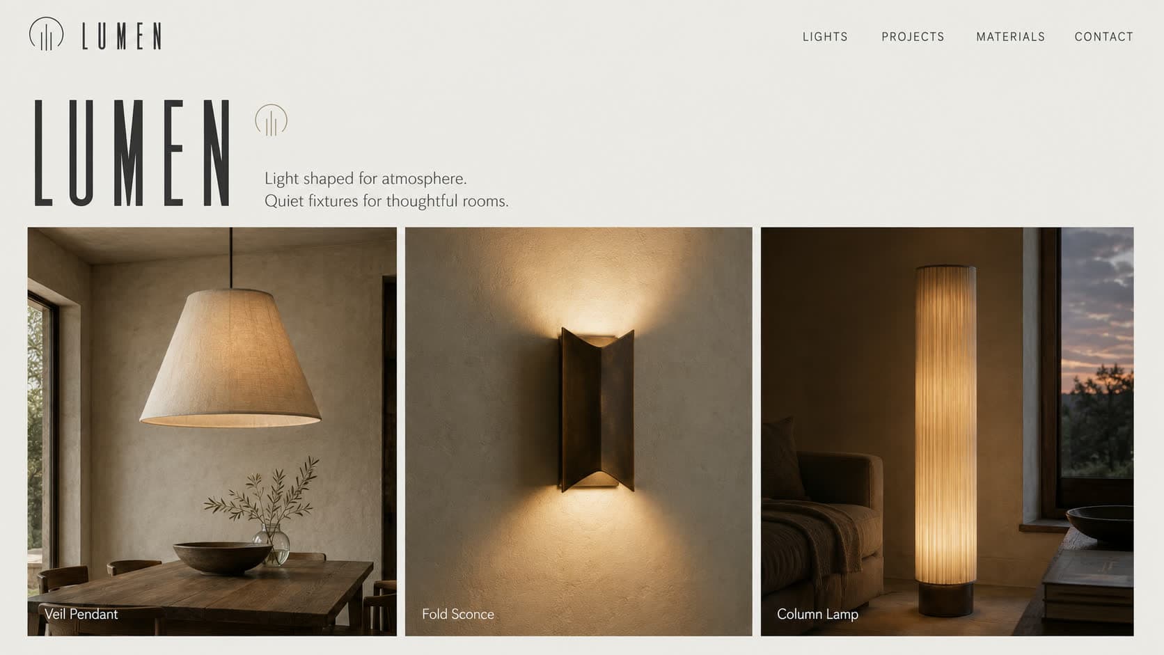
The Triptych Collection Hero borrows its structure from a gallery triptych: one enormous wordmark across the top, then exactly three products standing in their own panels beneath it, each with a small caption. Three frames, three bags, three bakes. The whole range in one glance.
When to use it
This pattern fits makers whose craft comes in a tight, considered range rather than an endless catalogue: an eyewear label with three silhouettes, a leather workshop, a bakery proud of this morning's three bakes. It states the brand first and proves it immediately below, so it doubles as both identity and shop window.
Why it works
Three is the number people compare comfortably. Two feels like a coin toss and five becomes a catalogue, but three invites a considered choice, and giving each product an equal panel signals equal craft. The oversized wordmark above does the branding work a slogan usually would, which keeps the page confident and quiet at the same time. Type this large also makes the site feel instantly editorial and expensive.