
Hero pattern
Editorial Bento Hero
A magazine spread built from tiles, headline and product together.
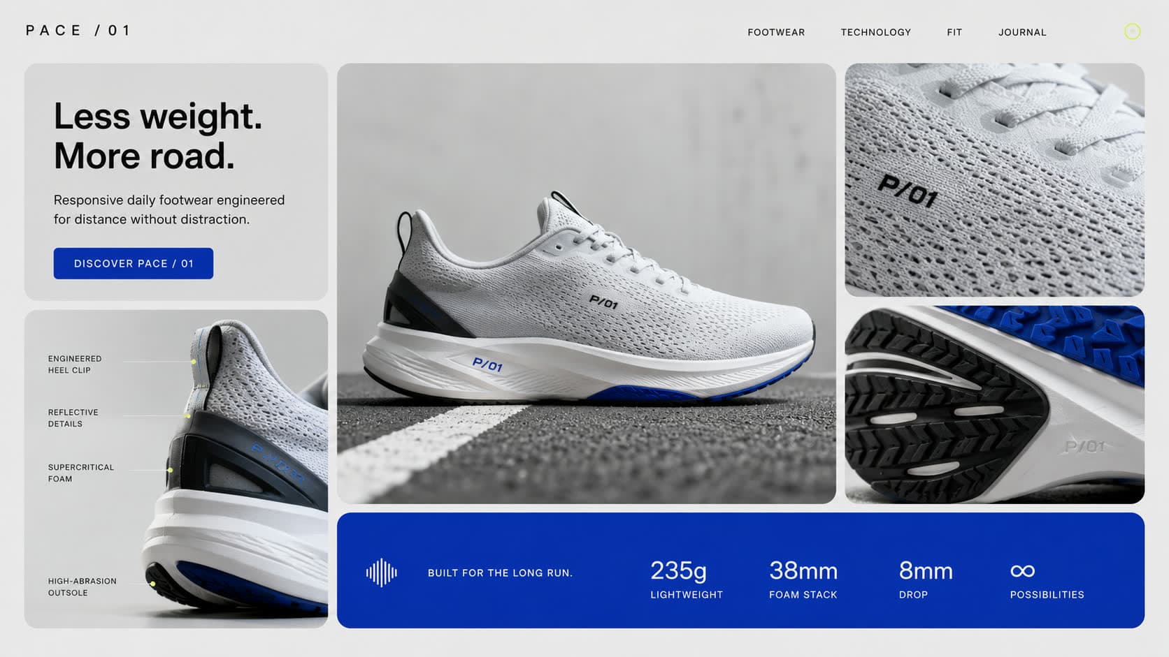
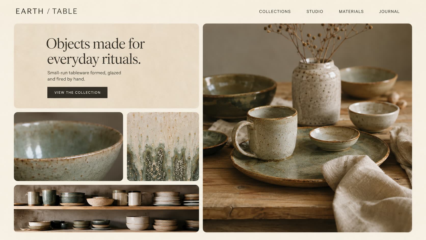
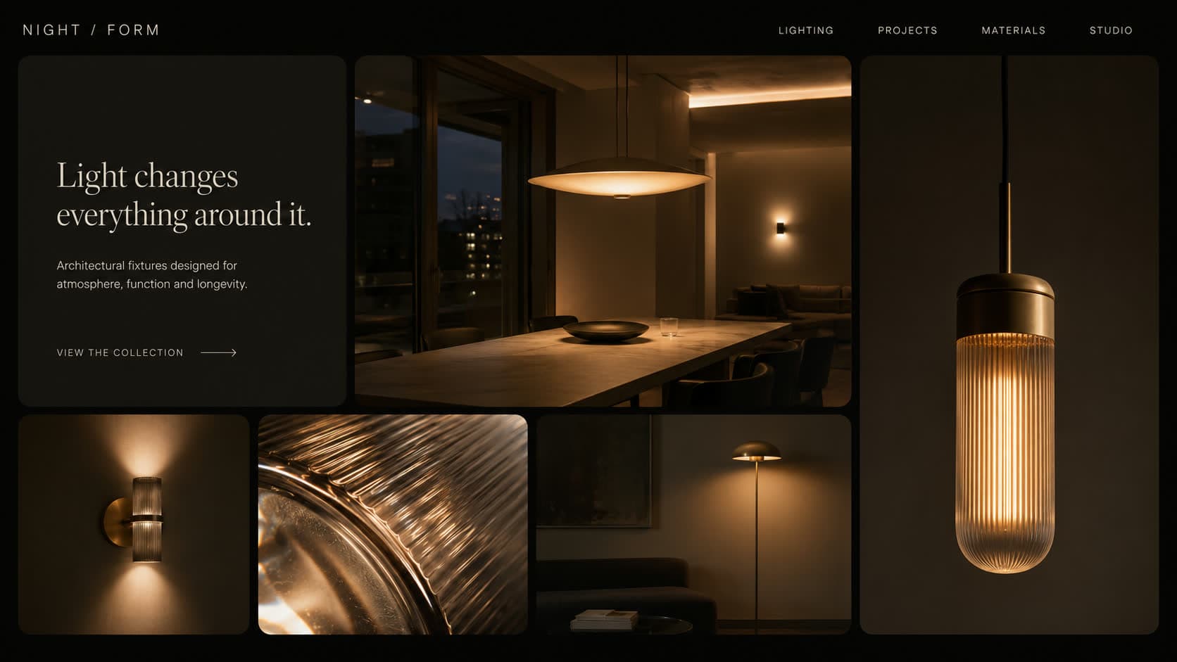
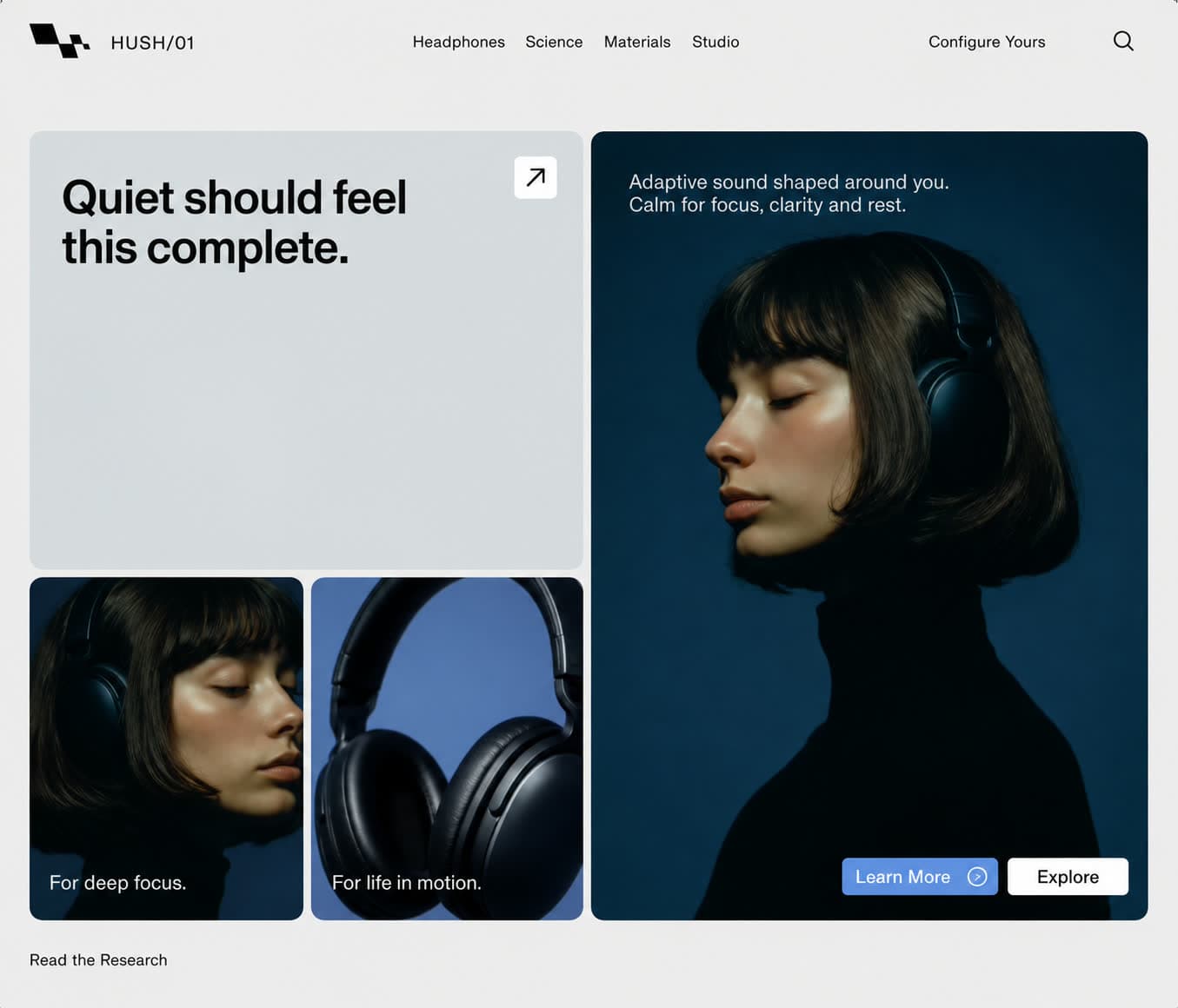
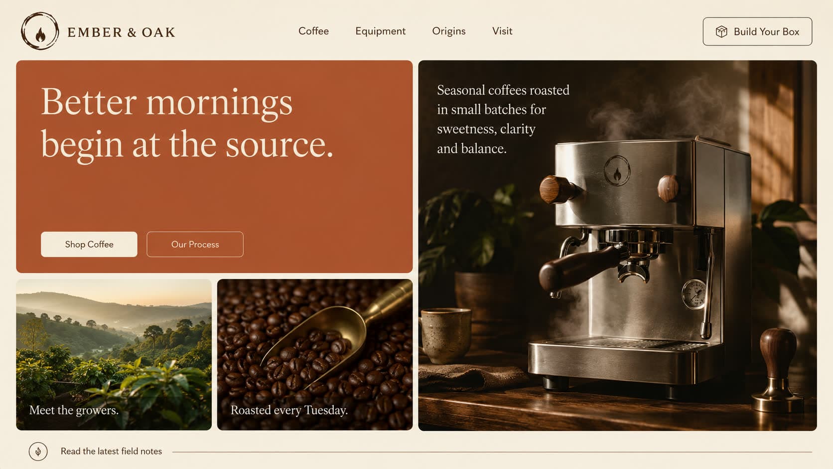

The Editorial Bento Hero arranges the top of the page like a magazine spread: a grid of unequal tiles where the headline occupies one, photographs fill others, and small blocks carry specs, colour or a single stat. The name comes from bento boxes, where different compartments make one composed meal.
When to use it
This is the pattern for brands with more than one thing to say at once. A running shoe with weight and drop figures, a coffee roaster with origins and gear, a skincare line with formula claims. Each message gets its own tile, so nothing fights for the same space. It also adapts to any mood, from bright sport to dark and moody lighting.
Why it works
Bento grids work because they let a visitor scan instead of read. The eye hops tile to tile in any order and assembles the story itself, which feels effortless. The structure also gives designers precise control of hierarchy: make a tile bigger and it matters more. That flexibility is why this layout has become the signature of modern product marketing pages.