
Clients rarely ask us for a website that looks good. They ask for one that looks premium, and they usually send a competitor's site to show what they mean. When we look closely at those references, the effect that caught their eye is almost never the reason the site feels expensive. It is the dozen quiet decisions around it.
This guide lists the nine details we see on every site that feels premium, why each one matters, and the small mistakes that undo them. None of them needs a big budget. All of them need someone to care.
1. Real photography, never stock
Visitors recognise stock photos instantly, even when they cannot say why. The handshake, the laptop on the white desk, the team laughing at a meeting. Real photographs of your space, your work and your people do more for trust than any layout, and they are the first thing a premium brand invests in.
Use each photo once. A picture that repeats on the homepage and the about page tells visitors you ran out, and it is one of the most common things we remove in a rebuild. If you are waiting for a shoot, a clean placeholder is better than a stock image you will forget to replace.
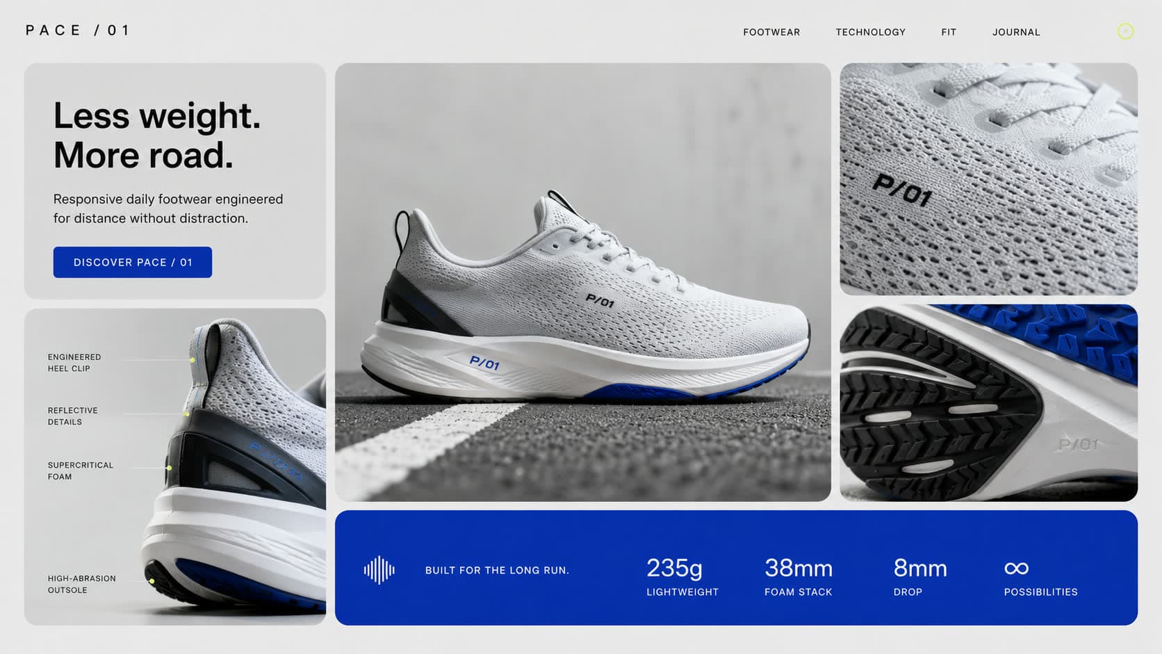
2. Fewer words, with a clear first line
Premium sites say less. The hero is a headline, one supporting line and one button, and every section after it makes one point. Long paragraphs on a homepage read as a business explaining itself, which is the opposite of the confidence a premium brand wants to project.
The words that remain have to be specific. Your name, what you do and who it is for, in plain language. Taglines that could belong to any company, like excellence in every detail, are the first thing we cut.
3. One or two typefaces, used with discipline
Typography carries more of a brand's feel than colour does. A premium site usually uses one typeface, or two at most, and sets a clear scale: one size for headlines, one for subheadings, one for body text, and nothing in between. Weight matters too. Headlines that are too heavy look loud, and loud rarely reads as expensive.
Watch the small labels as well. Tiny uppercase words above every heading and numbered markers like 01, 02 and 03 have become a sign of templated and AI generated design. Use them only when they tell the visitor something true, like the steps of a real process.
4. Space to breathe
Empty space is the cheapest luxury on a web page. Wide margins, room around headlines and fewer things per screen tell visitors that nothing here is competing for their attention. Crowded pages feel like a sale. Calm pages feel like a showroom.
Space also means fewer boxes. When every section sits inside a card with a border and a shadow, the page looks like a dashboard. Let full width photographs and plain text do the work, and keep cards for the things that really are separate items, like products.
5. Motion with careful timing
Movement is often what people notice first on a premium site, but what they are really noticing is timing. Photos that rise a moment apart instead of all at once. A panel that eases open and settles rather than snapping. Text that arrives in the order you would read it.
This gallery is a good example. The opening panel overshoots slightly before it settles, and that small curve is the difference between something that feels mechanical and something that feels made. We cover where motion earns its place in why modern websites use scroll animations, and the effects themselves in eight scroll animation effects for premium websites.
6. Transitions instead of jump cuts
On a basic site, clicking anything means a white flash and a new page. On a premium site, the photo you clicked grows into its own page and the header stays put. Visitors never feel the seams, and the whole site feels like one place rather than a stack of pages.
Transitions have to stay short, or they become waiting. We explain the four styles worth using and how long each should take in why page transitions matter.
7. Proof that looks as good as the rest
Client logos and reviews are where many good sites suddenly look cheap: a strip of grey logos in different sizes under a heading so small nobody reads it. A premium logo band uses a proper heading, logos in their real colours at a consistent size, even spacing and a steady speed.
Reviews work the same way. Real Google reviews with names, shown calmly, beat a grid of anonymous quotes in boxes. If you want more ideas, our guide to showing testimonials on a website has five live examples.
8. Nothing that looks AI generated
A new tell has appeared in the last two years: websites that look machine made. Purple to blue gradients, glowing buttons, glossy 3D blobs, every section in a rounded card, and copy full of long dashes and phrases like unlock your potential. Visitors may not know why, but they feel it, and it reads as cheap.
The fix is the same as everything above: real photos, specific words, restraint with colour and fewer decorative effects. A brand's own colour used as an accent, like lipstick on an outfit, looks more premium than any gradient.
9. Speed
A premium site that takes five seconds to appear is not premium. Fast loading is part of the impression, especially on phones and mobile data, which is how most Singapore visitors arrive. Compressed images, short and well encoded video, and effects that animate cheaply all matter here.
The good news is that motion and speed are not opposites. Most slow sites are slow because of oversized images and too many scripts, not because of animation, as we explain in do website animations slow your site down.
What quietly cheapens a website?
A popup that covers the headline the moment you arrive. The old Ron & Rich site opened with a newsletter box over its hero, and the rebuilt site has none. Logos stretched or retyped in a different font. Photos cropped to different shapes in the same row. A purple payment button from a plugin that clashes with everything else. A mobile version that was clearly an afterthought.
None of these are expensive to fix. Together they are often the whole difference between a site that looks like a template and one that looks like a brand.